Our goal at Digital Outfitters, is to provide measurable results for our customers using a width of services and depth of experience.  Each company we work with requires specific techniques and tactics to get their business to perform well online, especially in competitive markets and industries.

By gathering information and creating a Competitive Analysis for your business, we will be able to chart out how your business is performing online using measurements that include (but are not limited to):

  • Website Performance
  • Website Calls-to-Action
  • Website Contact Information
  • Search Engine Results for Popular Keywords
  • Search Engine Results for Competitive Keywords
  • Google Maps Results
  • Google My Business Page Results
  • Google Reviews
  • Broken Links
  • Incorrect Contact Information Online
  • …and many more factors.

For each of the values in our Competitive Analysis, we run through the same factors for your competition.  Using your competition as a yardstick to show how/where you need to continue to grow to remain competitive in your industry.

For more information, fill out the form below – and we’ll be in touch soon with the results of your competitive analysis.


  • Home
  • Portfolio
  • Services
    • Digital Marketing Consulting.
    • Website Management.
    • Website Hosting.
    • Brand Strategy.
    • Graphic Design.
  • Contact Us
$500 Competitive Analysis 
Site Logo
  • Open menu
    • Home
    • Portfolio
    • Services
      • Digital Marketing Consulting.
      • Website Management.
      • Website Hosting.
      • Brand Strategy.
      • Graphic Design.
    • Contact Us
08 Mar, 2018

Logo Design

08 Mar, 2018
  • Categories: Branding, Design, Logo   •   
  • No Comments   •   
  • by nicklabrant

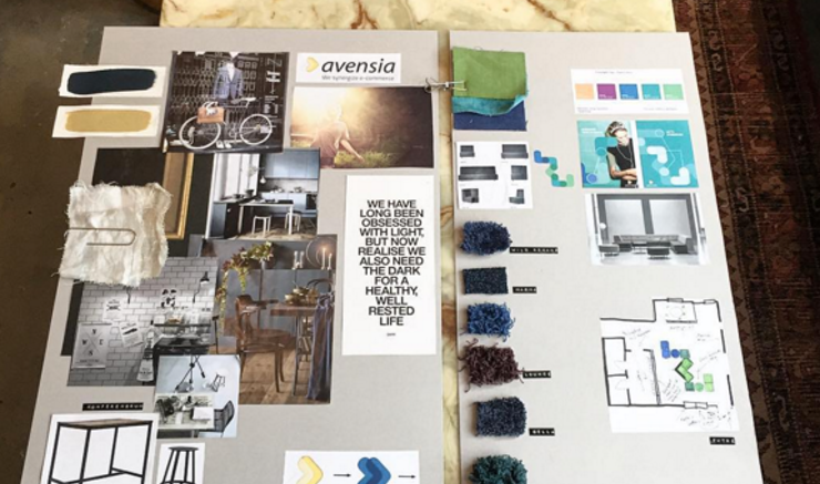
For the past couple years, i’ve been trying to go back to my roots in graphic design – especially in the area of logo design for small businesses.  I think that there are far too many bad logos out there.  If you take a look around as you’re driving to work, or to get groceries – pay attention to the signs outside of businesses.  Take a gander at the small pizza places, the deli’s, the laundromats.  More often than not, you’ll see a lot of text-based typography, with the business name printed out in basic lettering – without any attention paid to the style or feeling that they are trying to convey to their customers.

I understand that as a culture, we are made to believe that logos and brand names cost a lot of money, but the fact is – not having a brand, not having a logo…

It’s costing you way more!

I don’t doubt that you will be frustrated when the competitor down the street opens their doors with a fancy new logo, bright – attention grabbing colors, and a remarkable sign that starts stealing your customers.

So…  why don’t you become that awesome business?  This whole world is full of checks and balances, and if you don’t go out and start taking some of those customers – you are basically giving them to your competition.  They aren’t going to beat a path to your door without some sort of motivation.  Step up, get a new style, get their attention – and start being the company you wouldn’t want to compete with!

We’ll be in touch soon.  ; )

08 Feb, 2018

Industry Research

08 Feb, 2018
  • Categories: Logo, Research   •   
  • No Comments   •   
  • by nicklabrant

A professional logo design should put that image of your company’s perfect customer in the forefront – and focus on it with high intensity.  What would your customer like to see in your logo?  What logo would ‘pop’ to them?  How can you make your company more attractive to your potential customer?  These questions can be handled by market research, surveying others online, and requesting honest feedback from friends and family.  Don’t take the feedback with a grain of salt – because the information you receive can be extremely beneficial to your company’s future.  If you are the most professional, clean, reliable, hard-working, on-schedule company in your industry – but your logo looks like a heavy-metal band…

You aren’t doing any helping your company.

The logo itself is causing you to lose business!  That example is a bit extreme – but the situation described can mirror your business, in a small way.  It’s difficult to gain the trust of your customers and to build out a reputation as the best in the business…  why would you harm those chances by turning away a portion of your income?

Where to go for Help

There are a lot of great services online that feature designers who are ‘starving’ for your work, but it’s wise to do some research first, and realize that the final designs won’t be exactly what you were imagining.  Fiverr offers $5 logos delivered within 24 hours, but you can imagine the level of work that you receive for a designer who charges five dollars for a logo.  I don’t have anything against Fiverr, but remember that the quality of work delivered would be best suited to add to your idea-board for your brand, instead of a final-draft quality logo.

As with the rest of the chapters in this book – if you think you can handle the work yourself, by all means – do some homework, remember the lessons in this book – and go for it!  If you find yourself having a difficult time during the design process, find a professional in your area that can help design you a timeless logo.


08 Feb, 2018

Logo Design

08 Feb, 2018
  • Categories: Branding, Logo   •   
  • No Comments   •   
  • by nicklabrant

A very simple way to communicate your brand identity to potential customers is your logo, but designing it yourself can be a mess of overly complicated decisions.  If you’re stuck in this maze of confusion, the best thing you can do is to take a step back and examine the goal you are trying to achieve with your logo design task.  If you are too focused on the specific design – you could unintendedly display your own personal opinions and styles, mirroring brands that aren’t in your industry, or worse yet – adding too much of your own personality.  “You don’t like it?  But, I really like Comic Sans!”

Remember that what you want DOES NOT MATTER as much as what your customer is looking to find.

Let me repeat that more clearly…


“What you want, does not matter as much as what your customer wants.”


This comes as a shock to many businesses, who have lived with a logo they ‘like’ for many years.  Since they’ve started the business, way back in the 1980’s – they haven’t considered any changes – since they are happy with what they have.  (One of my least-favorite sayings – “If it ain’t broke, why fix it?)  They have a few hats, some big magnets for their trucks – but the truth is, what does the customer think of their logo?

Are you ready for the truth?  The customer doesn’t care – because they are checking out your competitor’s shiny new logo.  Meanwhile, your logo (and company) are fading back into the dark recesses of your customer’s memory.

Need proof?

  • Restaurants
  • Real Estate Agents
  • Food Packages
  • Auto Dealers
  • Gas Stations
  • Shoe Companies
  • Clothing Companies
  • Soft drinks

These highly competitive industries are all guilty of changing/updating their logos to remain ‘top-of-mind’ in their customer’s minds.  If you are in a competitive industry, think about your customer’s logo – and if it’s changed in the past five years.  It doesn’t have to change much – but just enough to warrant a second-glance – because that’s all it can take to keep that logo in the mind of your customer! Have they even bothered to ask their customer if a new logo would be good for their company?

If you have an aging logo – and are wondering if it works for your company, or if a redesign would even be right for you, stop reading and ask your friends/family what they think of your current design.  Post it on a social network, ask a waiter, talk to a friend at a gas station, or send a quick note to a trusted friend – and get some feedback.  You might be surprised what information comes your way.

Another aspect to keep in mind, is that there are trends which could age your logo prematurely – such as gradients, beveling/embossing, or vintage (intentional aging) filters or overlays.  Just search for “old logos” online, and you’ll find some examples, which have (no doubt) had to be redesigned in less than ten years.


If you want a logo that will stand the test of time – make sure that it works in solid black & white, without any colors, textures, shading, shadows, etc.  With all these options removed, is the logo spaced properly – letters set with proper kerning, and generally appealing?  If so, that’s great – but make sure that you aren’t being fooled into a ‘great’ logo that is just covered in shadows/textures or more options obscuring the true design.

Size can also be a factor in logo design – as it truly matters what you are going to be printing the logo on, when picking width of lettering or details in the logo itself.  If you plan on printing the logo on pencils or pens, you would think that it wouldn’t be a good idea to put too much detail into your logo.  When you decide on a good logo – this should be kept in mind, that you don’t know what you’ll be putting the logo on in the long term.  Imagine T-Shirts, business cards, coffee mugs, signs, billboards, newspaper ads, and more options.  If any of those might seem odd – you could come up with an ‘alternate’ logo, which could add either a border to bigger elements, or remove detailed text on smaller options.

08 Feb, 2018

Idea-Board (Mood-boarding)

08 Feb, 2018
  • Categories: Branding, Logo   •   
  • No Comments   •   
  • by nicklabrant

When you first start your brand – you are going to want to spend some time and reflect on your perfect customer.  Who are they? Where do they shop for clothing? What restaurants do they frequent? What are the colors that they associate with? Do they want the work done as quick as possible, or do they want it done right – no matter the cost?

Each of these factors should be gathered onto a sheet of paper – and saved, so that you can go back to it for reference during this chapter.

The concept of ‘Mood-boarding’ has helped companies realize what their ideal customer would like to see from your brand.  Gather logos that you like, gather colors you think would work well, gather pictures and images from the internet that match what you think your customers need.  If you are struggling with colors for your brand – take a visit to your local home improvement store, and grab some paint swatch samples.  Mix and match the colors, holding different shades next to each other until you find a combination that is both attractive and matches what your potential customer may be looking for in your industry.   If you are unable to find two (or more) colors that match well, you can grab a catalog (also by the paint swatches) in the home improvement store.  They have color combinations that match well for interior/exteriors of our homes – which will help you to build a combination that will work for your research needs.

Below is an example of a well-done moodboard.  You can see that they’ve gathered some images from online, and together, they work really well together – establishing the ‘mood’ of the company, which will help with your marketing efforts in the future.

During the Mood-boarding stage, take care to not ‘echo’ another brand too closely – as the result might backfire.  Just because Starbucks uses green and white cups, recycled materials, wood (comfortable) interiors for their coffee shops, and portrays an eco-friendly lifestyle – your masonry company might not see the benefit of those same efforts.  “Hey, it worked for them – why not me?”

The reason behind this is a lot more complex that I’d like to cover in this book, but the result of copying another brand – is that you could end up having to alter your brand if the popularity of that brand fades, or tastes change…  and tastes do change quickly.  Overnight, brands have become black-listed due to indirect reasons such as: controversy, news, recalls, etc.  If your brand so closely echoes another, it can be difficult to retain your own separate image.  If you go your own route – and develop your own brand, the results will be more catered to YOUR perfect customer – and will be a much more rewarding experience.  (Note:  As I explained earlier in this chapter, there are ways to exploit the issues with much larger brands to differentiate between yourself and the ‘big dogs’ – but when you are developing your brand, stand out as the company who can do what the big company couldn’t.  Take pride in your flexibility, but whatever you do – don’t try to slide right in next to a major brand and try to ride with them.  There isn’t a ‘draft’ alongside a major brand…   instead, you’ll likely be hit with a lawsuit, or at least a cease and desist letter – especially if your brand too closely follows another’s: logo, colors, fonts, style, etc.)

Take a half hour once per week and capture some of these efforts by your competitors – the colors of their logos/websites, graphics on their vehicles, business cards designs, uniforms, the overall message they are trying to deliver, their motto or tagline – and work with those details to distinguish your company from the others.  If you can stand out as your own brand, unique from the competition – while capturing the style that is desired by your potential customers, you’re on the right track!

Gather all these scrap papers, pictures, printouts, paint swatches, etc. – and put them in an envelope and write ‘Mood-board’ on the outside, and place somewhere relatively easy to access.  If you’re more computer savvy, use a program like Microsoft Word to paste your ideas into – and save them as “Mood-board” for reference later in this book.  If you are artistic, and a bit crafty – try doing this stage as a physical board.  Get a sheet of foam board from an office supply store, and start sticking your company influences to the board itself.

  • Archives

    • March 2018
    • February 2018
    • October 2017
    • August 2017
  • Recent Comments

    • Categories

      • Branding
      • Custom Email Address
      • Design
      • Do It Yourself
      • Domain Name
      • Email
      • Local Business
      • Logo
      • Mobile Ready
      • Online Reviews
      • Pay Per Click
      • Research
      • Search Engine Marketing
      • Search Engine Optimization
      • SEM
      • SEO
      • Uncategorized
      • Website
      • Website Hosting
    • Meta

      • Log in
      • Entries RSS
      • Comments RSS
      • WordPress.org

    © Digital Outfitters 2025. All rights reserved.

    • Widgetized Area

    • Go to Appearance » Widgets tab to overwrite this section. Use any widgets that fits you best. This is called “Bottom 1”

    • Widgetized Area

    • Go to Appearance » Widgets tab to overwrite this section. Use any widgets that fits you best. This is called “Bottom 2”

    • Widgetized Area

    • Go to Appearance » Widgets tab to overwrite this section. Use any widgets that fits you best. This is called “Bottom 3”

    • Widgetized Area

    • Go to Appearance » Widgets tab to overwrite this section. Use any widgets that fits you best. This is called “Bottom 4”